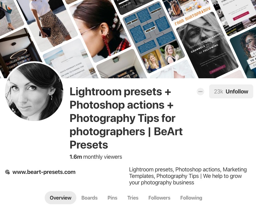
5 Great Tips to maximize your Pinterest presence!
Pinterest is sometimes overlooked by photographers as a useful social media platform in which to maximize your presence. It's free, so are you using it to its fullest capacity? Here are five tips to help you ensure you broaden your Pinterest presence.
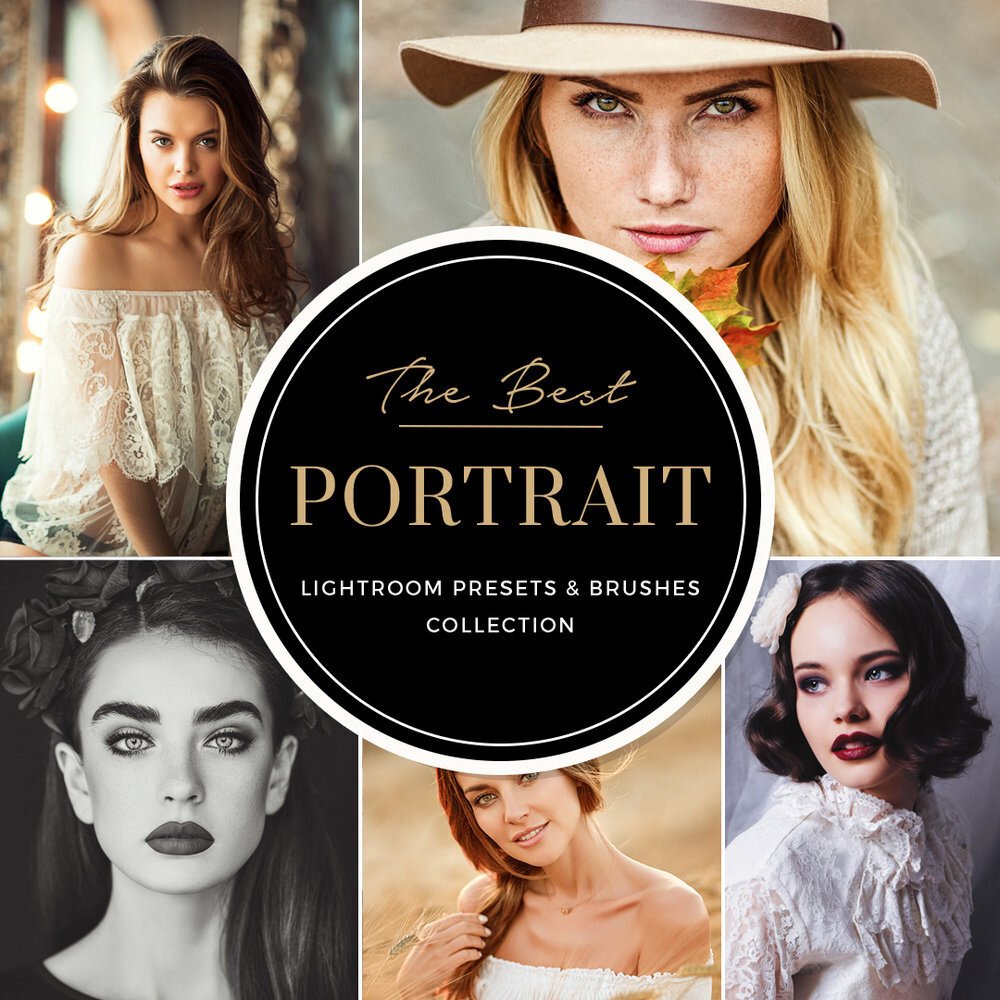
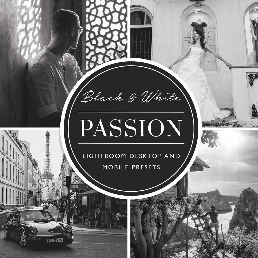
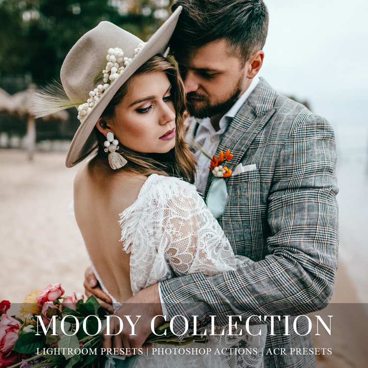
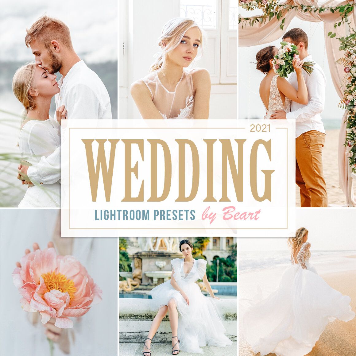
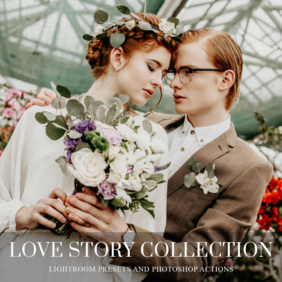
Looks matter. On Pinterest, it's not just the quantity of your pins; it's attractiveness as well. Are you creating beautiful pins likely to engage viewers? Your pins should have a title or headline that grabs people and makes them want to click through. When, if ever, did a boring title make you feel like clicking on a pin?
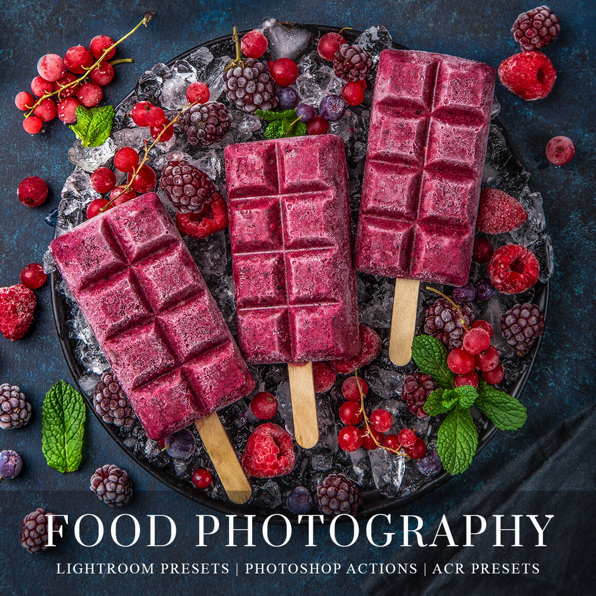
1. Use great quality images. Using poor quality or uninteresting pictures aren't going to entice someone to click on the pin. Give it the best you've got but make sure to watermark or identify your work to avoid someone plagiarizing or stealing your image.
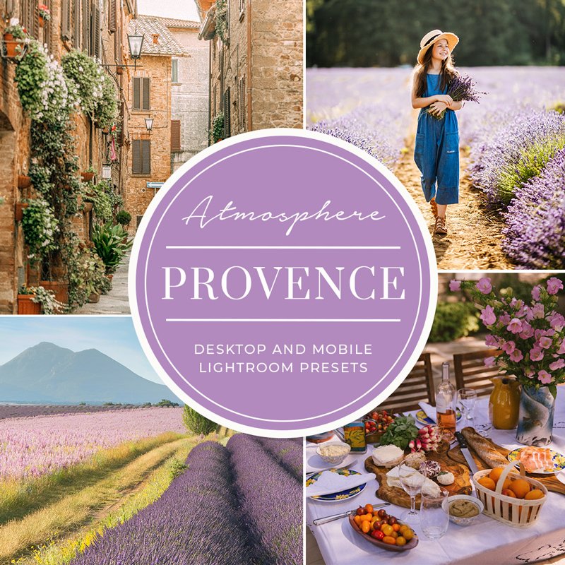
2. Consider the background you use carefully on a pin. If you have a brand color scheme, stick with that for an easy and additional branding opportunity. If you have text, consider black or white to avoid a cluttered or busy look. We think solid backgrounds look best (to draw the eye to your image) and we strongly suggest you color coordinate the background color to the image.
3. Make your wording clear and concise. Think like a newspaper journalist so that people can read quickly and easily. Short and sweet titles or headlines are the best! Remember that people are scrolling through the page, usually devoting nor more than a few seconds.
You want to grab them quickly. We love Canva for creating nice looking text and backgrounds. Always include your website or other relevant information somewhere in your pin to help drive website track and further click-throughs. As we've said above, always watermark. If you have a logo, consider using it somewhere in the pin or on your image.
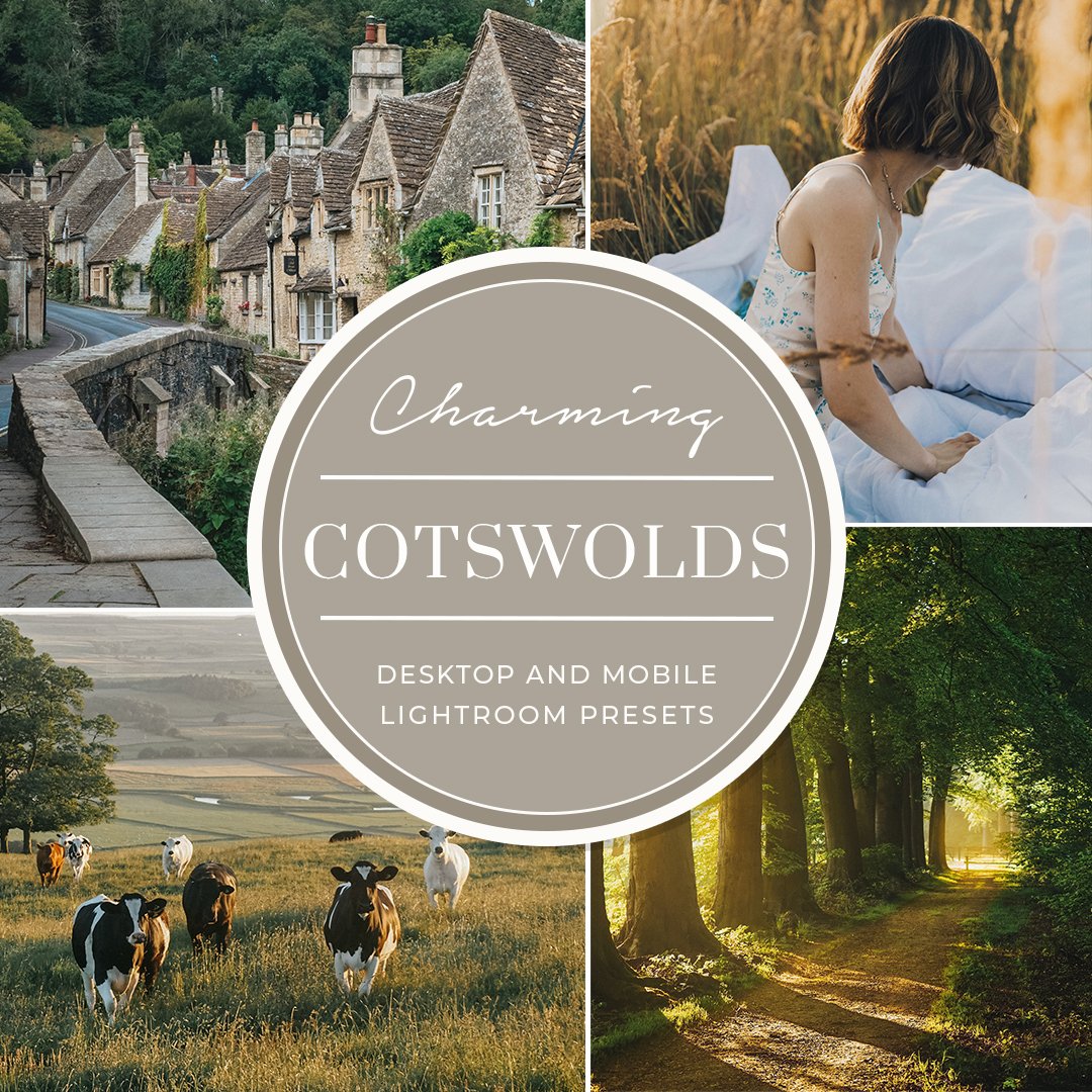
4. Create vertical (and long) posts, ideally taller than 1100 pixels. This gives the pin more real estate on the page as people scroll. The more they see of it, the more likely they are to click on it. Avoid funky or script fonts.
5. Don't forget to include a call to action such as "click now" to get viewers to click through. Yes, a headline or title is critical to grabbing them, then a call to action motivates them further. Your goal on Pinterest is to generate click-throughs to your website. That equals potential new clients. If you have a promo or discount being offered, create a pin for it.
Write it so that a viewer will want to learn more about what they might win or get by clicking through. You can offer anything from freebies to discounts to newsletter opt-in for regular updates. Remember, that you can create multiple pins for the same offer or idea! Just make some minor edits to the original pin and re-use it. Be sure to change some of the text for SEO purposes!


