How To Build A Cohesive Instagram Feed For Your Blog
Instagram is likely one of the best social media platforms - if not the best - for photographers to showcase their work to the general public.
Below, we have some suggestions to help you create a good Instagram feed - one that will attract viewers. Our ideas are based, in part, on Sunday Chapter's post as well as our own experience as photographers and small business owners.
Give them your best:
The first thing to keep in mind is that social media today is like an Internet calling card or storefront for creatives wanting to get their work noticed. It's entirely possible that whatever you share might be the first thing someone sees of your work. That makes it critical to upload your best work and effort. To attract new clients, you should post the best you've got.
Creating a knock-out Instagram feed:
Leverage Instagram well, and there's the potential to woo someone into becoming your client. In other words, you can use social media as the public face of your work.
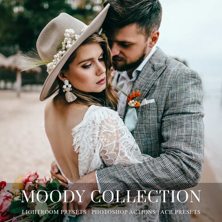
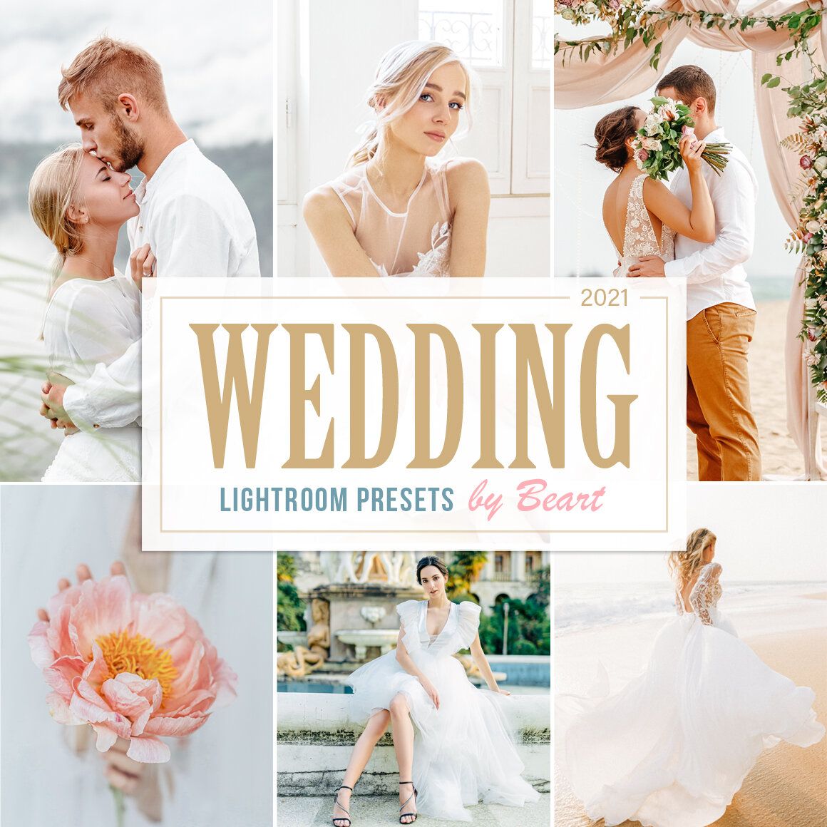
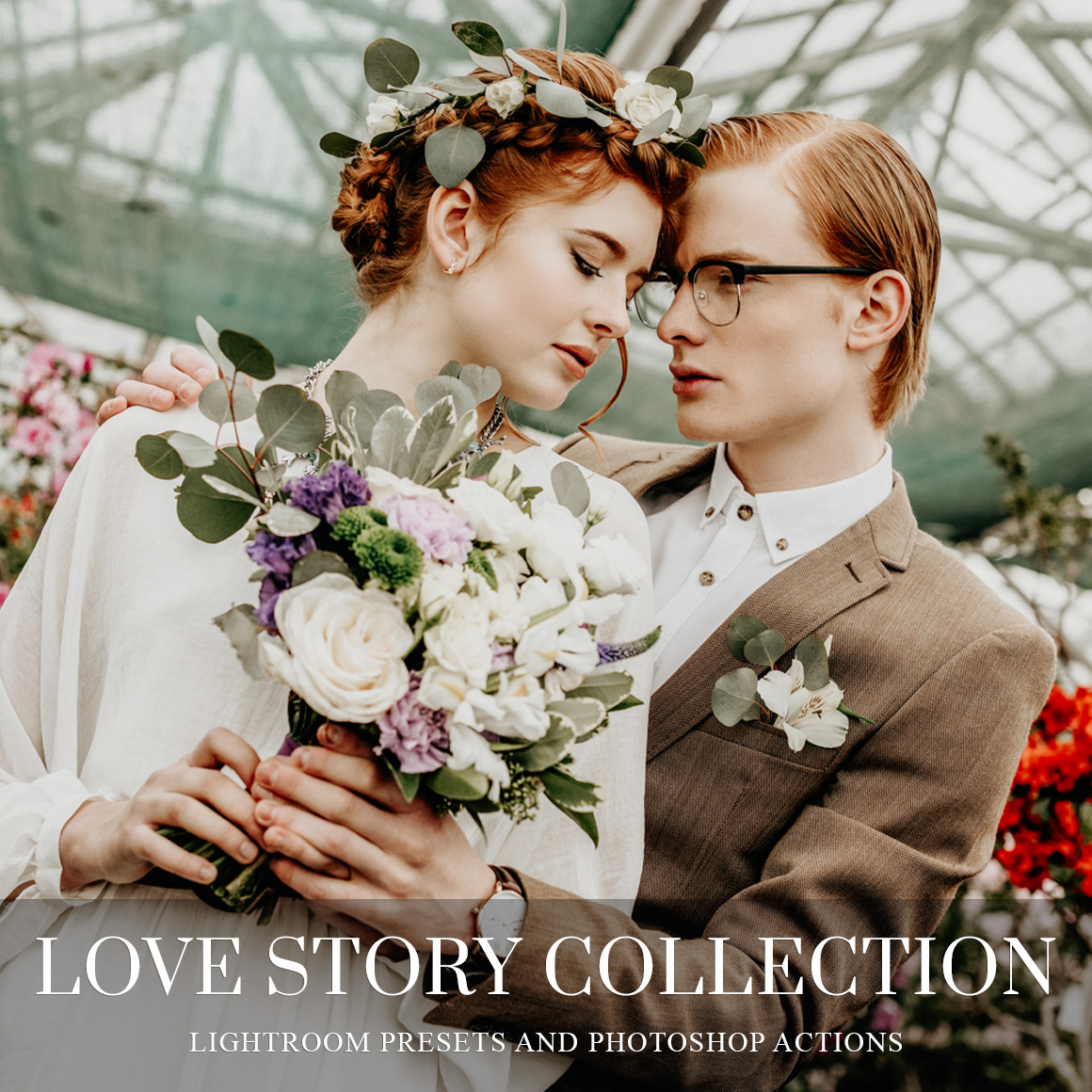
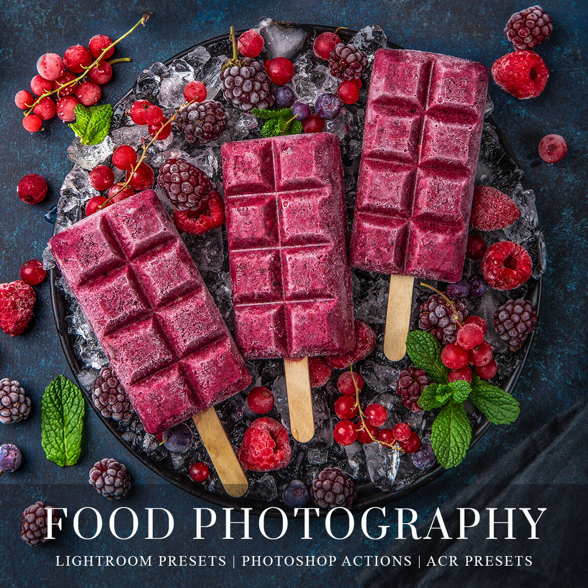
If you want to create an attractive and high converting Instagram feed, check out our Lightroom Mobile presets for bloggers and find your own style! Here's an example of using our Moody Collection.
What's your style?
If you have a particular style or specialization, use Instagram to show it off. Use appropriate hashtags to attract viewers. When viewers scroll through your feed, you want to demonstrate consistency between the pictures. A visual flow to your images is more appealing to the viewer. If you have a particular style, eventually your followers will begin to recognize your work before even seeing your name. A good example of this is Elena Shumilova (elena_shumilova) whose iconic style is easily recognizable through her beautiful and ethereal images on Instagram. If you browse her feed, you'll see what we mean when we talk about consistency and flow. Her feed is eye candy for the photography lover.
If you have a style or branding, then show it off.
Need extra help creating a gorgeous looking Instagram feed? Check out our Instagram Templates!
Create Cohesion:
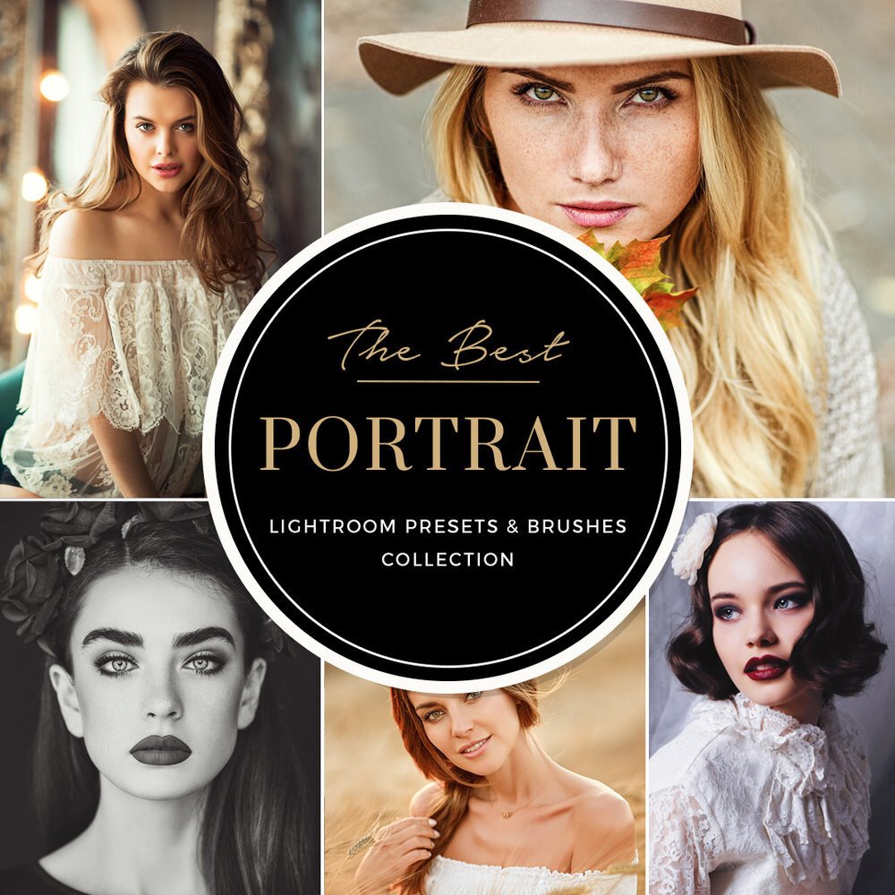
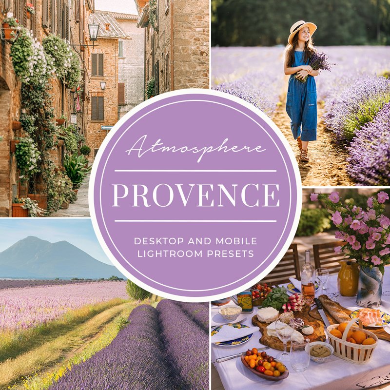
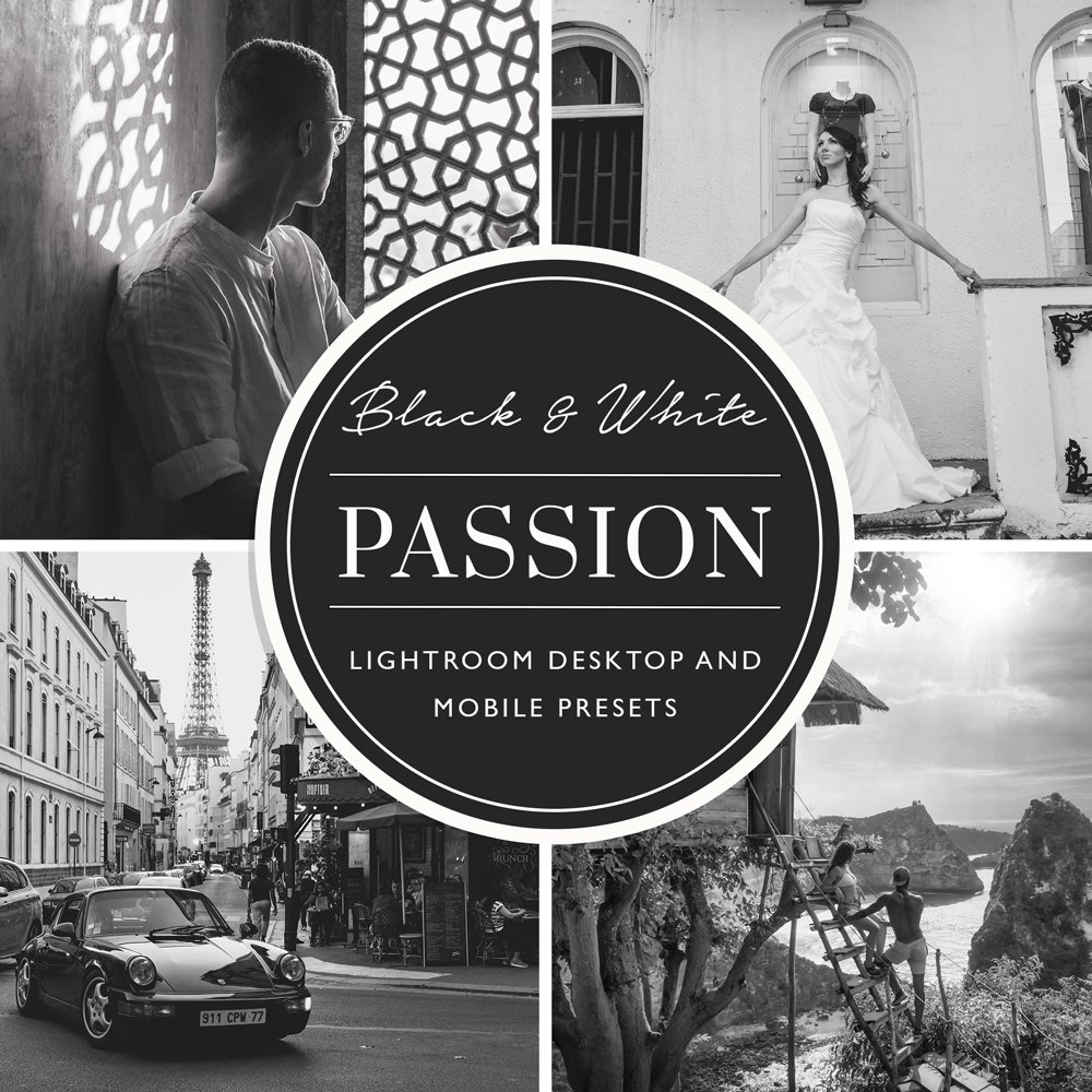
A great Instagram feed is like a well-designed room: everything looks well placed, flows well together and coordinates beautifully. Your Instagram feed should do the same. How do you do that? Create visual appeal by acting as your own "interior designer" for your feed. Select images which, when scrolled through, coordinate in some way - whether it's through color or tone, subject, etc. Lightroom presets can make it easy to enhance your images to help you create a particular look or branding style. As we've said many times, the advantages of Lightroom are many. Presets quickly become indispensable for the photographer wanting to apply certain tones, looks, or enhancements without spending hours editing.
Whatever your genre in photography, be selective in the images you upload.
Design your feed
We agree with Sunday Chapter that without too much fuss you can plan out (design) your feed. Take those extra few minutes designing your feed for visual flow. Once you've identified images you'd like to share as we suggested in the previous point, plan them out so they'll show up together. They should coordinate or complement each other well. (Sunday Chapter recommends UNUM and Planoly, which we've never tried.)
It's your feed. You should design it in such a way as to best showcase your work and style! Check out more tips on leveraging Instagram.


